Creating animated icons
Introduction
G4P V4.1 allows the user to create animated icons (GAnimIcon) as well asnon-animated icons (GIcon) to be used with the text-icon controls GButton, GLabel, GCheckbox and GOption.
This guide explains how to use your own animations with these controls.
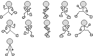
Animated icons in action.
This video shows the text-icon controls with animated icons.
Creating an animated icon
The starting point for all animations is the sprite sheet. Here is the one used for the running man (In reality the white background is in fact transparent). This is a tiled image with 5 columns and 3 rows which G4P will slice into 15 frames numbered 0-14.
Note that frame numbering is left to right top to bottom and the first frame is always 0 (zero).
So in this image frames 0-4 show the man running to the left and frames 5-9 to the right. Frame 10 is the man standing still. Although the last four frames are empty they will still be created.
This image is 320 x 196 pixels so each frame will be 64 x 64 pixels. If you are creating your own sprite sheets there should be no space horizontally or vertically round the sprites, the whole image is used to make the frames.
Once you have the image file you can create the animated icon with one of two constructors
GAnimIcon(PApplet papp, String fname, int nbrCols, int nbrRows, int interval)
GAnimIcon(PApplet papp, PImage image, int nbrCols, int nbrRows, int interval)
The first one expects the name of the image file while the second expects a previously loaded image.
So if we have declared a GAnimIcon variable called ai then we can create the animated icon with the statement -
ai = new GAnimIcon(this, "stickman.png", 5, 3, 100);The first parameter is the PApplet object responsible for drawing the icon, in single window applications it will always be this. If the icon is to be added to a control in another window (GWindow) then it should be the window identifier (variable name). The third and fourth parameters are the number of tiles horizontally and vertically in the image. The last parameter is the time interval between displaying frames measured in milliseconds (100ms = 1s), the smaller the value the faster the animation.
Once we have instantiated a GAnimIcon object we can define named animation clips with the method
GAnimIcon storeAnim(String id, int start, int end, int interval, int nbrLoops)The first parameter id is a user defined unique identifier for the animation clip. Later we can use this identifier to select a specific animation clip. The second and third parameter is the start and end frame numbers for the clip. In most cases end > start but that is not essential, if end < start then the frames are shown in reverse order. If end == start then it is a single frame like the standing man. The fourth parameter, interval, is the time interval between frames. The final parameter, nbrLoops, is optional specfies how many times the animation clip should be played before stopping. If this parameter is missing or has a value <=0 then the animation clip loops continuously.
The following statement creates three named animation clips.
ai.storeAnim("TO LEFT", 0, 4, 100).storeAnim("TO RIGHT", 5, 9, 100).storeAnim("STILL", 10, 10, 100, 1);Notice that the TO_LEFT and TO_RIGHT animation clips will play continuously because the last parameter nbrLoops is missing. The final animation, STILL, is the single frame of the man standing still, and the nbrLoops parameter value is 1 (no point looping on a single frame).
Note: all animated icons have an animation clip called ALL which loops continuously through all the frames in order and the time interval will be that specified when the icon was instantiated.
We are now ready to add the animated icon to a control, in this case a label, using the method
void setIcon(GIcon g_icon, GAlign pos, GAlign horz, GAlign vert)The first parameter defines the icon position relative to the text and the last two parameters the icon alignment. See this guide to find out about icon positioning and alignment. To leave any of these values unchanged pass the value null. So in this statement
label.setIcon(ai, GAlign.NORTH, null, null);The icon will be positioned above the text. Everything is ready so we can start a named animation with the statement.
label.getIcon().animate("TO LEFT");GCheckbox and GOption controls
These are boolean controls which means their value is either true or false. When an animated icon is added to one of these controls then two more named animation clips called SELECT (false > true) and DESELECT (true > false) are created for you. The SELECT animation will play all the frames in numerical order once and the DESELECT animation will play all the frames in reverse numerical order once. In the vdeo above the GCheckbox (bottom left) is using the default clips.
You can also define your own SELECT and DESELECT clips and this is shown with the GOption controls (bottom right). Notice that we are using the same animation sequences for all 3 option buttons, so it mabe tempting to add the same GAnimIcon to all 3 buttons. This would be a mistake, an animation icon should only be added to a single control and never reused. The way round this is to copy the icon and add it to another control but if you forget then G4P will make a copy for you.
If we have created a GAnimIcon called ai then we can use it with our three option buttons like this
// add the original icon to the first button
option0.setIcon(ai, null, null, null);
// use a copy for the second button
option1.setIcon(ai.copy(), null, null, null);
// use another copy for the third button
option2.setIcon(ai.copy(), null, null, null);
This assumes that all three option buttons have already been instantiated.
The example shown in the video is included in the library examples for you to experiment with.